ESPAÑOL
Dutch architect Gerrit Rielvield's masterpiece, the Schröder house
(1924), stands as the most important example of Neoplasticist architecture. In 2000 UNESCO
included it in the World Heritage list because it was considered "an
icon of the Modern Movement in architecture and an outstanding
expression of human creative genius in its purity of ideas and concepts
as developed by the De Stijl movement" and "whose radical
approach to design and the use of space, occupies a seminal position in
the development of architecture in the modern age.".
BACKGROUND
Frits Schröder was a lawyer married to Truus Schröder, a pharmacist.
They owned a building on Biltstraat Street in the quiet Dutch city of
Utrecht. There Mr. Schröder allowed his wife to modify a room at will
and for that purpose she commissioned the design to Gerrit Rietveld.
When Mrs. Truss Schröder widowed she decided to move to a new property,
and given the successful design experience with Rietveld, she again
gave him the commission of her new house in 1924, in which she wanted
to express his vision of how a woman should live in a modern and
independent way.
She actively participated in the design of the house and is furniture
(this building is actually called the Rietvield Schröder House) and
lived there for 60 years until her death in 1984.
Rietvield, meanwhile, used the opportunity to use the concepts of the De Stijl or Neoplasticism Movement,
which was based on the abstraction of all forms into orthogonal lines
and planes, and all the chromatic palette into primary colors, white and
black.
Rietvield himself rented an office in the house until 1932, and after
the death of his wife in 1958 he moved to this house, until he died in
1964
at the age of 76.
The Schröder Rietvield house is located in a suburb of the city of
Utretcht, in the center of Holland.
This neighborhood is composed of brick neoclassical houses, to the
point that
when I was walking down the Hendriklaan street looking for a symbol of
the Modern Movement, the conservative style of the houses made me think
that I was in the wrong place.
The home sits at the end of the street, facing a highway that crosses
perpendicularly (which certainly did not exist when the house was built,
as it was constructed in the 60's. Previously there was a small forest
to which the visuals of the social area were directed).
The house contrasts with its surroundings, both in form and in
proportions and materials, and precisely the massiveness of the
surrounding brick houses highlights the lightness and transparency of
this house made of concrete, steel and glass.
CONCEPT
The cubic volume of the building is broken, almost dematerialized and
reassembled into primary elements such as lines and planes, whose
transparency exposes its interior. Balconies, terraces and metal
columns intertwine trying to emphasize the immateriality of the volume.
The structure also frees the components of the building, separating the clearly expressing its function.
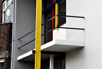
The planes, lines and colors of the facade and interior, painted in white,
black, red and yellow, evoke a Piet Mondrian composition.
However, the greatest contribution of the house is its interior space,
both for its flow and its visual connection to the outside. The house
consists of two levels, linked by a central spiral staircase.
The Rietveld house is noted for its flexibility, particularly in the second
level, where the rooms can be expanded or divided by deploying
panels, a concept that modern designers took from the traditional Japanese architecture. Its open plan contrasts with the closed layout of the houses of the time, composed of rigid rooms and spaces.
The multiplicity of functional options was a direct contribution
of Mrs. Schröder, who wanted a house that would offer different lifestyle alternatives.
Interestingly, the private spaces are arranged on the first level, while most public ones are located on the second level.
First level. Plant and axonometric.
Second level. Plant and axonometric.
"... We didn't avoid older styles because they were ugly, or because we couldn't reproduce them, but because our own times demanded their own form, I mean, their own manifestation. It was of course extremely difficult to achieve all this in spite of the building regulations and that's why the interior of the downstairs part of the house is somewhat traditional, I mean with fixed walls. But upstairs we simply called it and 'attic' and that's where we actually made the house we wanted."> Gerrit Rietveld.
For this purpose Rietvield, who was initially a carpenter, installed a
series of foldable panels which can divide the space into different
shapes, changing the interior according to needs of area, lighting and
privacy.
The following 3D model video explains the components of the house.
DETAILS
The Neoplasticist style of the house is complemented in its details, in
the windows and accessories, such as furniture, to the point of
establishing an
ongoing dialogue with the architecture that contains them.

Red and Blue Chair and Chair Zigzag two Rietveld creations
The Schröder house remains valid to this day due to its apparent
modernity: simple volumes and rational lines that evoke a Piet Mondrian
painting in three dimensions, its frank flexibility, airy transparency and
fluid spaciousness have inspired numerous contemporary works.


