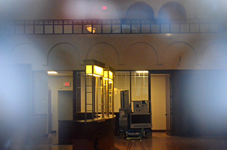
Looking northeast at the end of the lobby, in a photo that I took on October 25, 2012. Thankfully, the arches are still there. Look at the photo below for a comparison.

Looking northeast at the end of the lobby, in a photo taken in 1925, on opening day.
Picture yourself entering this huge, open lobby. Which setting would have overtaken your senses? OK, I know the photo at the top leaves a bit to the imagination since I couldn't get such a wide view, and there is a piece of equipment sitting on the floor. Even if I had been able to see it all and could have provided you with a better comparison, would that have made a difference? Not to me. I'd still have to vote for the breath-taking view in the vintage photo. And I still wonder how the sun-filled lobby smelled with all of those bouquets on site.

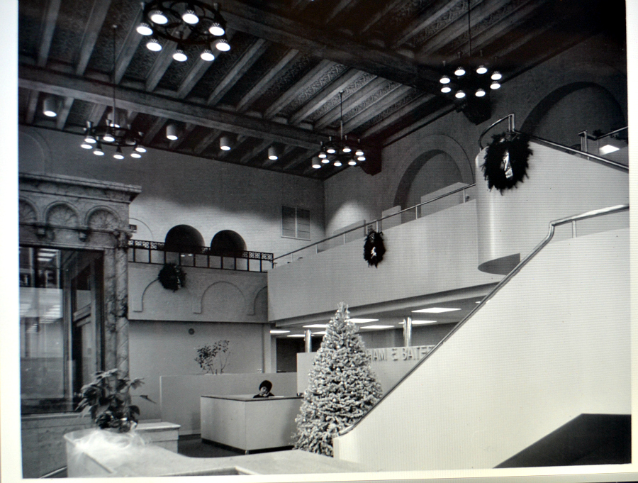
Here's the lobby as it was when the application was made, in a photo taken in 1977 or 1978. Durham and Bates would have been the occupant at that time. The gorgeous glass and what looks to be marble shape on the left side of the photo is the entrance portico situated on the west side of the lobby. The back of this photo says: Interior view of Old Bank of California Building looking Northeast in former banking lobby, now office space, showing extended mezzanine.
Here's information about the building's interior from the paperwork turned in to the National Register of Historic Places: The building's main floor, originally the banking lobby, tellers' cages, and office platform, was designed as a grand two-story room with a handsome ornate coffered beam ceiling.The east wall has blind arches which echo the window forms of the west wall and, as with other Renaissance forms, are carried out in fine detail. As on the exterior, the interior finishes demonstrate the skill which had developed in the fabrication of imitation materials at the time of construction. Interior surfaces are almost entirely cast materials--an integrally colored plaster, formed to look like travertine marble. Only the Escollette marble vestibule, marble floor of the banking lobby, and the tellers' counters, which have been removed, are of genuine materials. The floor incorporates three kinds of marble--Hungarian Red, Taverne Le Pink Tennessee, and Jaune Nile. At some subsequent time, the colored "travertine" plaster was painted a rather yellowish color. During the recent remodeling, it was repainted to a beige tint more akin to the original color.
In adapting the former banking room for use as office space, the original 16' wide mezzanine along the north wall was extended south against the east wall to the south wall. An additional free-standing stair was added to connect the new mezzanine to the main floor. Architects for the renovation--Fletcher, Finch, Far and Associates--designed all partitions, railings, and other added forms in a contemporary style in order to strongly contrast with the original building forms. This was further carried out by the selection of contrasting colors for the new design elements, with no attempt being made to copy the renaissance colors and forms of the original design.